
DPI, Image Resolution, and Why Blurry or Dark Interiors Happen in POD Printing
Sometimes a book looks perfect on your screen and quietly falls apart the moment it’s printed. The images look dull. The pages feel darker than expected. Diagrams that were sharp suddenly look soft and slightly fuzzy. It is frustrating, especially when everything looked fine before you clicked publish.
This is usually the point where authors assume the platform messed up. On the surface, that actually assumption feels reasonable.
The truth is far less dramatic and far more technical.
Print on demand works by rules that screens simply do not follow. Your laptop, phone, and tablet are designed to display light. Printed books are designed to absorb ink. When images are prepared for one environment and pushed into the other without adjustment, quality drops quietly and consistently.
This is where DPI and image resolution step in.
DPI Basics Without the Confusion
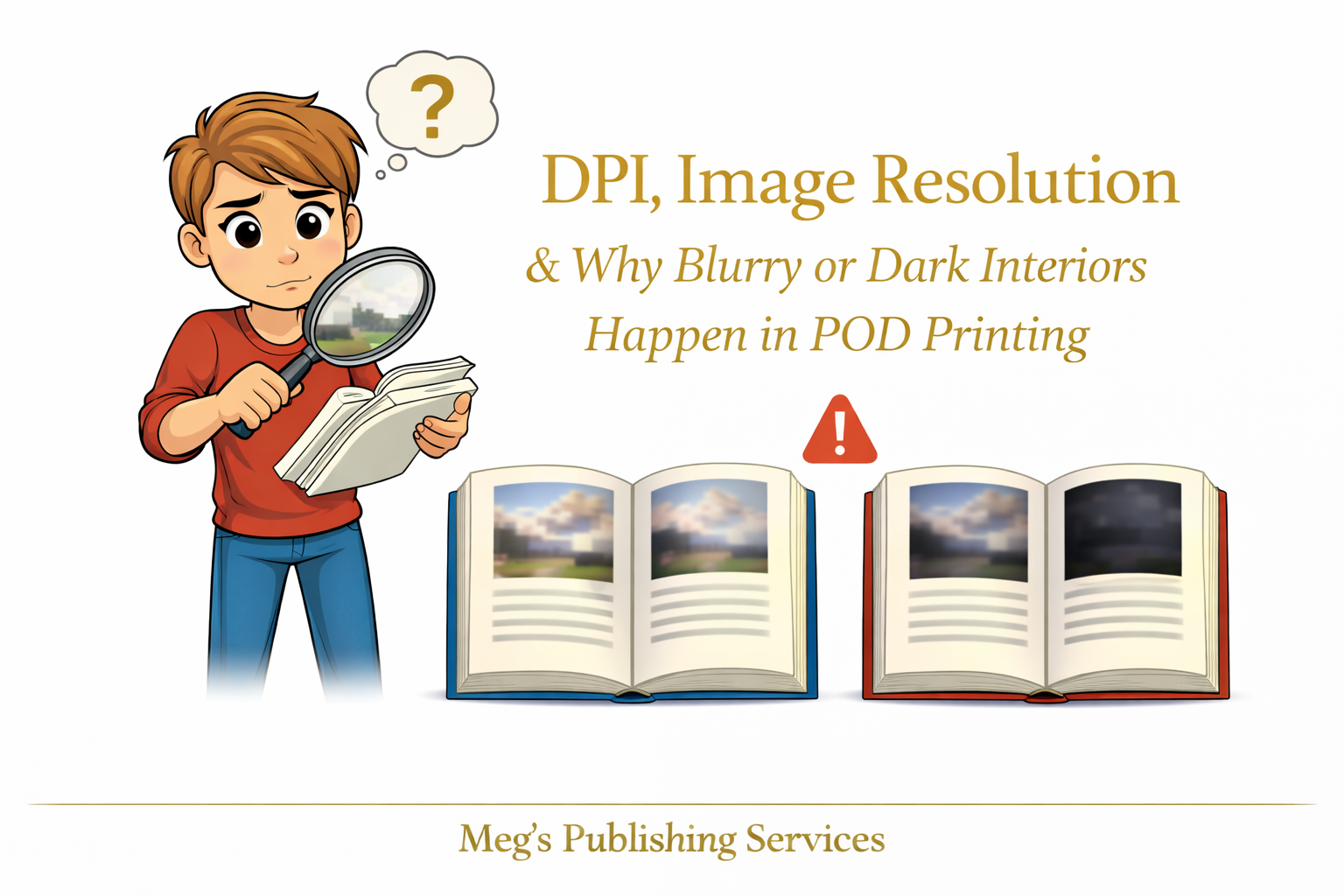
DPI simply means dots per inch. It describes how much detail an image can hold when it is printed.
Images prepared at seventy two DPI are optimized for screens. They load fast, look crisp on devices, and behave well online. But when they are printed, there is not enough information for the printer to work with. The result is softness, pixelation, or muddy detail.
Images prepared at three hundred DPI are built for print. They contain enough data to translate cleanly onto paper. Lines stay sharp. Text inside images remains readable. Visuals hold their structure.
The issue is that screens make low resolution images look better than they actually are. Print does not offer that grace.
Why Images Look Fine on Screen but Fail on Paper
Screens compress information intelligently. They fill gaps. They brighten shadows. They smooth rough edges.
Printers do none of that.
When a low resolution image reaches a print on demand system, the printer prints exactly what it receives. No enhancement. No correction. No second guessing.
If the file lacks detail, the printed result reflects that lack with brutal honesty.
This is why an interior can look professional in preview mode and disappointing in your hands.
The Hidden Role of Color Compression in POD
Another quiet culprit is color handling.
Most screens display images using RGB color. Print on demand systems convert those files into CMYK for printing. During that conversion, colors are compressed to fit print limitations.
What happens next surprises many authors.
Blacks become darker. Grays lose subtlety. Backgrounds that looked light on screen suddenly feel heavy on paper. Images lose contrast and feel flat.
This is not sabotage. It is physics.
Print has a narrower color range than screens. If images are not prepared with that limitation in mind, the final result skews darker and duller than expected.
A Familiar Situation That Explains Everything
An author once sent us a workbook filled with charts and screenshots. On screen, everything was clean and easy to read. In print, the pages felt heavy. The charts were harder to interpret. The entire interior felt visually tiring.
Nothing was broken. The images were simply exported for digital use and never rebuilt for print.
We rebuilt the images at print resolution, adjusted contrast intentionally, and prepared them specifically for ink on paper. The second print run felt lighter, clearer, and far more professional without changing the content at all.
The difference was not design talent. It was technical preparation.
How to Prep Images Correctly for POD
This is the part authors rarely hear explained clearly.
For interiors that include images, charts, or diagrams, preparation matters as much as writing.
What helps:
Export images at three hundred DPI at final print size
Avoid stretching images inside layout software
Increase contrast slightly for print clarity
Test dark areas intentionally rather than trusting previews
Build images for print first, then adapt for digital if needed
What hurts:
Copying images directly from websites
Relying on screenshots without rebuilding them
Assuming preview tools show print reality
Letting software auto handle resolution decisions
Print on demand is precise, not forgiving.
The Part Authors Rarely Want to Hear
Platforms do not ruin images. They reveal how images were prepared.
Once you understand this, the frustration fades and control returns.
This is one of those behind the scenes details that quietly separates books that feel polished from books that feel homemade, even when the writing is strong.
One Calm Thought to Sit With
When print quality disappoints, the fix is usually not dramatic. It is technical. Technical issues are solvable once they are understood.
Books that print beautifully are not lucky. They are prepared for the environment they are entering.
That difference matters more than most authors are ever told.