
Vector vs Raster: Why Your Cover Designer’s File Type Can Make or Break Your Print Quality
There is a reason some book covers look expensive before you even understand why. Nothing is obviously wrong with the others. They just feel slightly off. Soft where they should be sharp. Fragile where they should feel solid.
That difference often comes down to something most authors never ask their designer about. File type.
Not color. Not fonts. Not even layout. File type.
Once it goes wrong, no amount of re-exporting can fully save it.
Cover design lives at the intersection of art and engineering. The image you see is only part of the story. What actually matters is how that image is built underneath.
This is where vector and raster graphics quietly decide whether your cover will scale cleanly, print crisply, and survive distribution across multiple platforms.
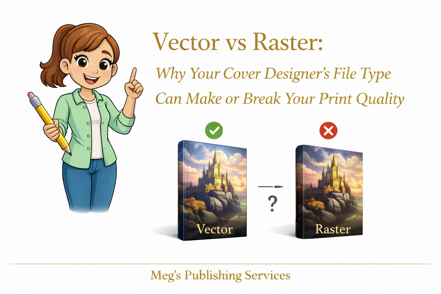
The Simple Difference That Changes Everything
Vector graphics are built from mathematical paths. Lines, curves, shapes, and text are defined by equations, not pixels. That means they can scale infinitely without losing quality.
Raster graphics are built from pixels. Every image has a fixed amount of information. Stretch it too far and the gaps show.
This distinction matters more than most authors realize.
Logos, titles, subtitles, and graphic elements should live in vector format. They stay razor sharp whether the cover is resized, adjusted, or reformatted for different trim sizes.
Photographs belong in raster format. They capture detail, texture, and realism that vector graphics are not designed to handle.
Problems begin when these roles are confused.
Why Pixelation Happens Even When the Cover Looked Fine
Pixelation does not appear because printers are careless. It appears because raster elements are pushed beyond what they can support.
A cover might look perfect at one size and quietly degrade at another. Letters lose edge definition. Fine lines break apart. Shapes that should feel intentional start looking fuzzy.
This usually happens when:
Text is flattened into raster images
Logos are delivered only as JPEG or PNG files
Covers are designed at low resolution and later resized
Designers export a single final image instead of layered source files
Once raster text is stretched, there is no way to restore sharpness. The information is already gone.
Scaling Is Where Covers Are Tested
Books rarely live at one size forever.
Trim sizes change. Platforms require adjustments. Distribution expands. New editions are created.
Vector elements adapt cleanly to these shifts. Raster elements resist them.
This is why some covers survive redesigns effortlessly while others require full rebuilds that cost time and money. The issue was not taste. It was structure.
Why KDP Sometimes Forces Re Uploads
When KDP flags a cover for quality issues, it is often reacting to underlying file limitations. The system detects that elements are not scaling or printing within acceptable thresholds.
Authors assume something broke. In reality, the file was fragile from the beginning.
KDP does not know your designer’s intent. It only sees whether the file can survive print conditions at scale.
When it cannot, re upload requests appear.
A Pattern We See More Often Than Authors Expect
An author once brought us a cover that had been redesigned three times. Each version looked good on screen. Each version printed slightly worse than expected.
The issue was consistent.
Every element, including the title and subtitle, had been flattened into a single raster image early in the design process. There was no vector text left to work with.
To fix it, the cover had to be rebuilt from the ground up. Same visual concept. Different construction.
The final print was sharp, clean, and stable across formats. Nothing magical happened. The foundation was simply corrected.
What Professionals Check Without Being Asked
Experienced publishing teams quietly verify things authors are rarely taught to question.
They ask:
Are the text and logos vector based
Are raster images placed at final size
Are layered source files available
Can this cover scale without degradation
These questions are not about perfection. They are about durability.
A Clear Thought to Carry Forward
A good cover is not just something you see. It is something that holds up.
When vector and raster elements are used intentionally, print quality becomes predictable instead of stressful. Covers stop breaking under pressure. Re uploads become rare. Confidence replaces guesswork.
That quiet stability is rarely accidental. It is built in from the start.