
Color Profiles and Why Your Cover Looks Different When Printed
There is a moment of quiet confusion when a printed book does not match what you approved on screen. The colors feel heavier. Bright tones look calmer. Blacks appear deeper. Nothing is obviously wrong, yet everything feels different.
This is not a mistake. It is a mismatch between two worlds that behave nothing alike.
Screens create color using light. Print creates color using ink. Those two systems do not speak the same language, even when the design itself is strong. This is where RGB and CMYK enter the conversation.
Why Screen Colors and Print Colors Do Not Agree
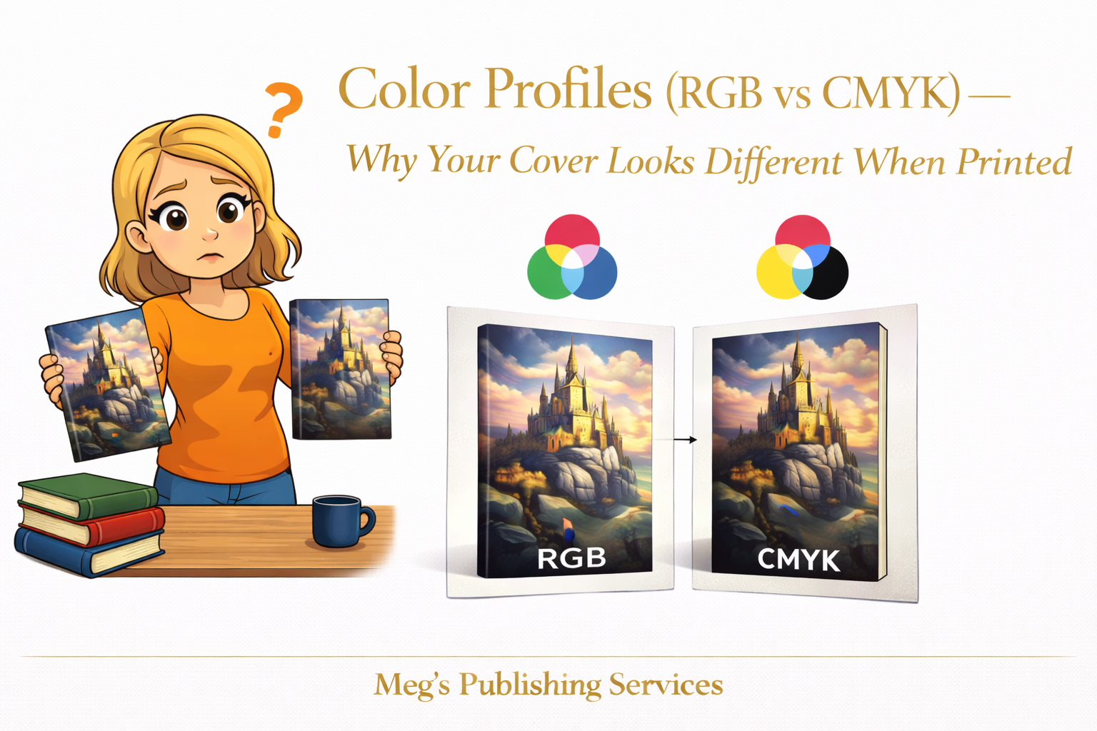
RGB is built for screens. It uses light to create color, which allows for brightness, glow, and vibrancy. Colors appear richer because they are illuminated from behind.
CMYK is built for print. It uses ink layered on paper. Colors are absorbed, not emitted. The range of colors that can be reproduced is narrower by nature.
When a cover designed in RGB is sent directly to print, the system must translate those colors into CMYK. During that translation, some colors simply cannot survive intact.
Why POD Conversions Quietly Dull Vibrant Covers
Print on demand platforms automatically convert files to meet printing requirements. This conversion is functional, not artistic.
Vibrant blues lose intensity. Neon tones flatten. Deep blacks can overwhelm surrounding detail. Subtle gradients collapse into solid blocks.
The platform is not trying to sabotage the design. It is working within the physical limits of ink and paper.
Without intentional preparation, the conversion does the best it can and the result often feels disappointing.
How Covers Should Be Prepared for Print
Professional cover preparation accounts for print behavior early, not after disappointment sets in.
That includes:
designing with CMYK limitations in mind
adjusting saturation intentionally rather than relying on automatic conversion
testing how dark areas reproduce on paper
accepting that some screen colors do not belong in print
Good designers do not chase exact matches between screen and paper. They aim for controlled, predictable results.
A Quiet Difference Between Platforms
Not all print on demand systems reproduce color the same way.
KDP prioritizes speed and consistency across high volume production. Ingram prioritizes distribution and bookstore compatibility. Those priorities influence how color is handled.
As a result, the same cover can look slightly different depending on where it is printed. This is normal and expected.
Understanding this difference helps authors set realistic expectations instead of chasing perfection that print cannot deliver.
A Situation That Makes This Clear
An author once approved a cover built around bright, modern colors that looked stunning on screen. The printed version felt muted and heavier.
Nothing was broken. The design had simply been optimized for light instead of ink.
After adjustments were made with print behavior in mind, the next proof felt balanced and intentional. Not identical to the screen version, but honest to the medium.
That distinction changed everything.
Something Worth Knowing Before You Panic
Print is not supposed to match your screen perfectly. It is supposed to look right on paper.
When color profiles are respected and files are prepared with intention, covers stop surprising you in the wrong ways.
The shift from RGB to CMYK is not a downgrade. It is a translation.
Like any translation, it works best when handled by people who understand both languages.