
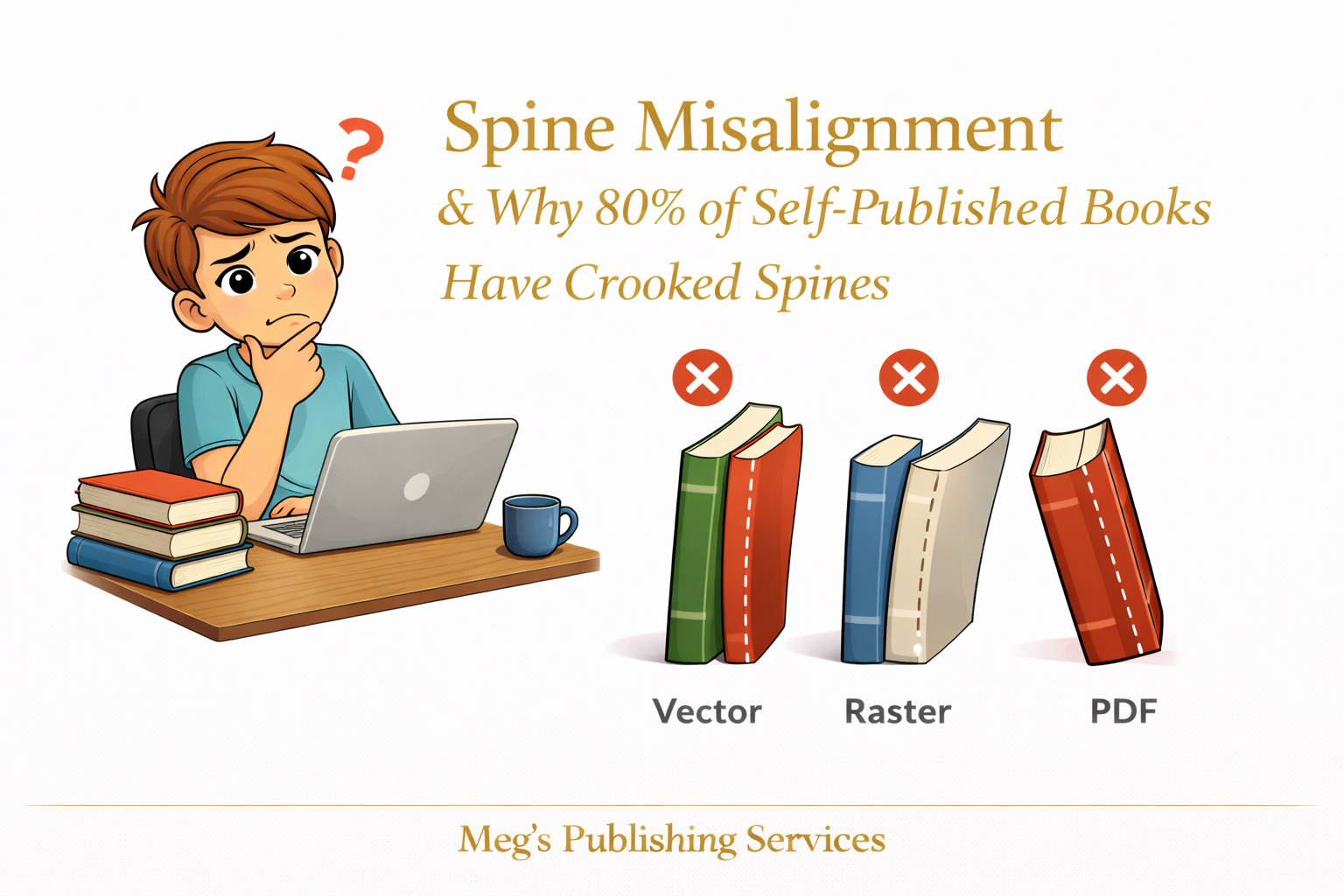
Spine Misalignment and Why So Many Self Published Books Have Crooked Spines
There is a particular kind of disappointment that only shows up once a book arrives in the mail. You turn it sideways, look at the spine, and something feels off. The text is not centered. The title leans. Sometimes part of it has vanished entirely.
The instinctive reaction is to assume a printing mistake but most of the time, what you are seeing is not an error. It is a misunderstanding.
Print on demand does not produce identical copies every single time. Unlike offset printing, POD allows for small shifts during trimming and binding. These shifts are normal and expected, but they require designers to work with tolerance rather than precision.
This is where many covers quietly fail.
Variance Is Built Into POD Printing
Every print run has allowable movement. Paper can shift slightly during cutting. Binding can drift by a fraction. Covers wrap around spines that are not mathematically perfect.
Individually, these variations are small. Together, they affect spine alignment.
When covers are designed as if printing is exact, even normal variance becomes visible.
Spine Width Is More Than a Calculator Output
Spine width is not just a number pulled from a calculator and dropped into a design. It depends on:
final page count
paper type
ink coverage
binding method
A slight change in any of these can affect how the spine behaves in print.
Designing a spine that fits perfectly on screen but leaves no room for movement is an invitation for misalignment.
Why Spine Text Disappears or Shifts
Spine text disappears for two main reasons.
First, the spine is too narrow to safely hold text. Many nonfiction books simply do not have enough page count for a readable spine title, but authors add one anyway.
Second, the text is placed too close to the edges. When trimming shifts even slightly, the text is the first casualty.
What looks centered digitally may not survive physical production.
Designing for Tolerance Instead of Perfection
Professional covers account for movement.
That means:
keeping spine text comfortably within safe margins
choosing font sizes that remain legible even if alignment shifts
accepting that spines are not precision surfaces
prioritizing readability over symmetry
Designing for tolerance is not lowering standards. It is understanding the medium.
A Scenario That Explains the Pattern
An author once ordered multiple copies of the same book. Each spine was slightly different. One looked centered. Another leaned left. A third trimmed the subtitle.
The file had not changed. The printer had not failed.
The design simply left no room for normal variance.
Once the spine was redesigned with wider safety margins and simplified text, the issue resolved across future prints.
What to Expect and What Is Actually an Error
Some variation is normal. Slight shifts are part of POD.
True errors include:
severe off center trimming
missing sections of the spine
unreadable text due to excessive shift
incorrect binding altogether
Knowing the difference saves time, stress, and unnecessary re uploads.
A Steadier Way to Think About Spines
Spines are the most fragile part of a cover. They live in the tightest space and face the most physical pressure.
When they are designed with realism rather than ideal conditions in mind, they hold up far better.
Crooked spines are rarely the result of careless printing. They are usually the result of designs that expected perfection from an imperfect process.