
The Click Magnet Blueprint
The exact elements every high-converting Amazon cover shares — distilled into one simple, repeatable formula
High-converting Amazon covers don’t win because they are prettier, louder, or more creative.
They win because they remove uncertainty.
When readers scroll Amazon, they are not looking for surprises. They are looking for reassurance. They want to feel confident that the next click will not waste their time or money.
Covers that convert consistently are not accidents. They follow a quiet blueprint that works across genres, audiences, and price points because it aligns with how the human brain makes fast decisions.
Once you understand that blueprint, cover performance stops feeling mysterious and starts feeling predictable.
Why covers convert or fail before a single word is read
Readers make a click decision before they consciously evaluate your book. Their brain runs a rapid safety check built from past experiences.
This check answers three questions almost instantly:
Does this look like the kind of book I’m searching for?
Does it feel trustworthy and professional?
Does anything here confuse or slow me down?
If the answer to all three is yes, the click happens.
If any one of them is no, the scroll continues.
The Click Magnet Blueprint exists to pass this test as cleanly as possible.
The core principle behind every high-converting cover
High-converting covers do not try to explain everything. They try to communicate the right things, in the right order, at the right speed.
They prioritize clarity over cleverness, recognition over originality, and hierarchy over decoration.
This is what the blueprint is built on.
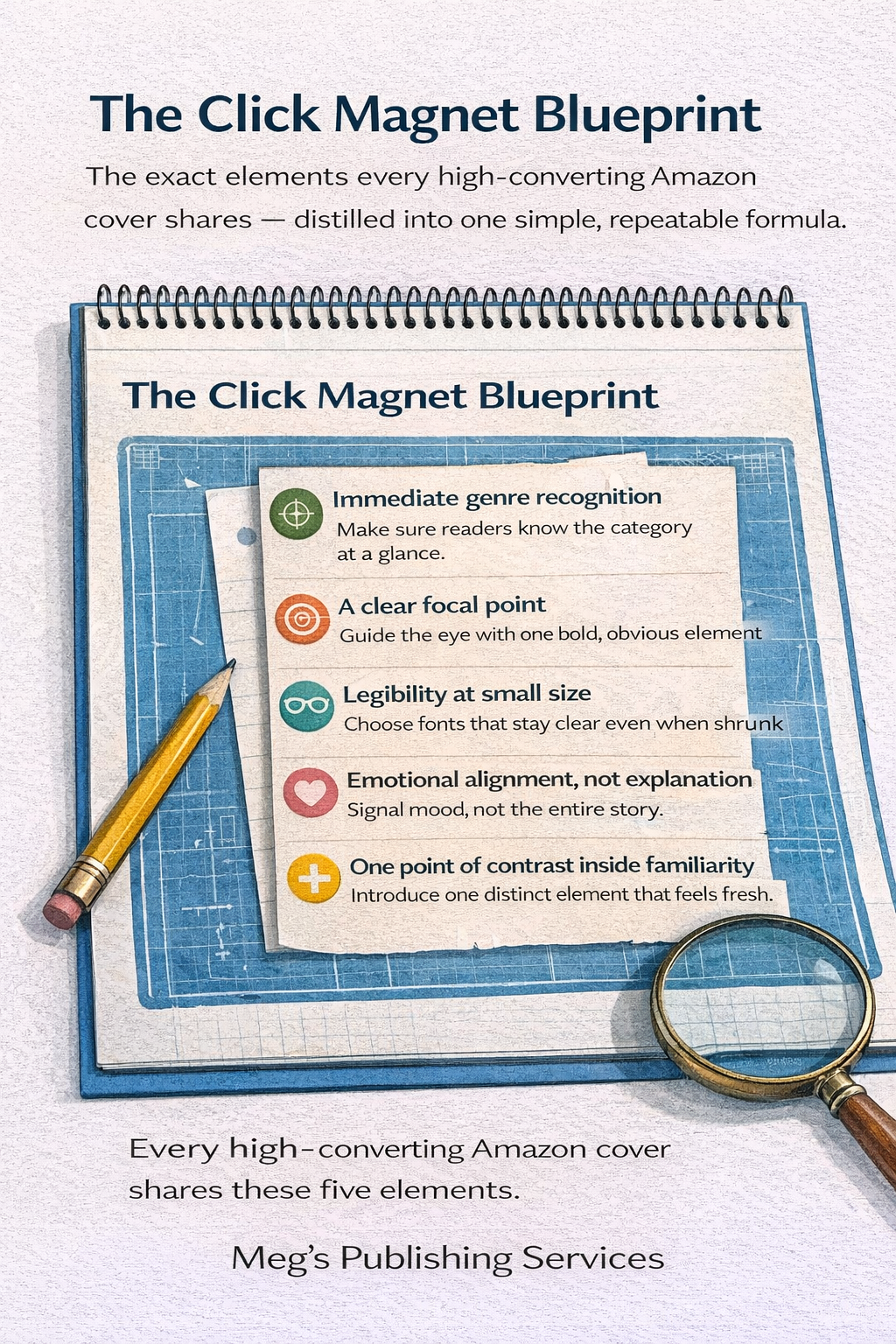
The Click Magnet Blueprint
Every Amazon cover that converts reliably shares these five elements, even when the genre, style, and audience are completely different.
1. Immediate genre recognition
At thumbnail size, the reader must know what category they are in without thinking.
This comes from familiar color families, imagery styles, and visual language the reader has already learned to trust. Genre recognition reduces risk. Reduced risk increases clicks.
If a reader has to interpret or guess the genre, the cover has already failed.
2. A clear focal point
Strong covers give the eye one obvious place to land.
This might be the title, a central image, or a bold visual shape, but it is never everything at once. The brain wants direction. When the eye knows where to go, the book feels calm and controlled.
When multiple elements compete for attention, the cover feels noisy and untrustworthy, even if the design is technically good.
3. Legibility at small size
Most Amazon browsing happens on phones. Covers that rely on thin fonts, delicate details, or complex layouts lose their message at thumbnail size.
High-converting covers remain readable when reduced, because the typography is bold, spaced correctly, and designed for clarity first.
If the title cannot be read instantly on a small screen, the cover cannot convert consistently.
4. Emotional alignment, not explanation
Effective covers communicate mood, not meaning.
They signal whether the book is intense, comforting, urgent, inspiring, or authoritative through color, contrast, and composition. They do not attempt to explain the story, theme, or message visually.
Explanation requires time. Mood registers instantly.
The faster the emotional promise is understood, the safer the click feels.
5. One point of contrast inside familiarity
The best covers follow genre patterns closely, then introduce one deliberate point of difference.
That difference might be a stronger title treatment, a bolder image, a cleaner layout, or a sharper promise. It is never chaos. It is controlled contrast.
This is what makes a cover noticeable without making it feel risky.
Why this blueprint works across genres
The Click Magnet Blueprint does not rely on trends. It relies on behavior.
Readers scroll the same way whether they are buying romance, nonfiction, thrillers, or business books. Their brain still wants clarity, safety, and ease.
Covers that meet those needs convert more often. Amazon notices that behavior. Visibility increases as a result.
This is why wildly different covers can all perform well if they follow the same underlying structure.
The most common mistake authors make
Many authors design covers from the inside out. They focus on what the book means, what they want to express, or what feels personally satisfying.
High-converting covers are designed from the outside in. They start with the reader’s expectations and work backward toward expression.
This does not erase creativity. It simply sequences it correctly.
How to use the blueprint without becoming generic
Following a blueprint does not mean producing boring or interchangeable covers.
It means removing confusion first, then adding personality where it will be noticed instead of punished.
Creativity performs best after trust is established.
When readers understand your book immediately, they are far more open to what makes it unique.
Final thought
High-converting Amazon covers are not magical. They are intentional.
They reduce friction.
They guide the eye.
They communicate quickly.
They respect how readers actually behave.
The Click Magnet Blueprint is not about copying other books. It is about aligning with how decisions are made in a crowded marketplace.
Once your cover becomes easy to understand, it becomes easy to click.
And on Amazon, the easiest books to click are the ones that get seen again and again.