
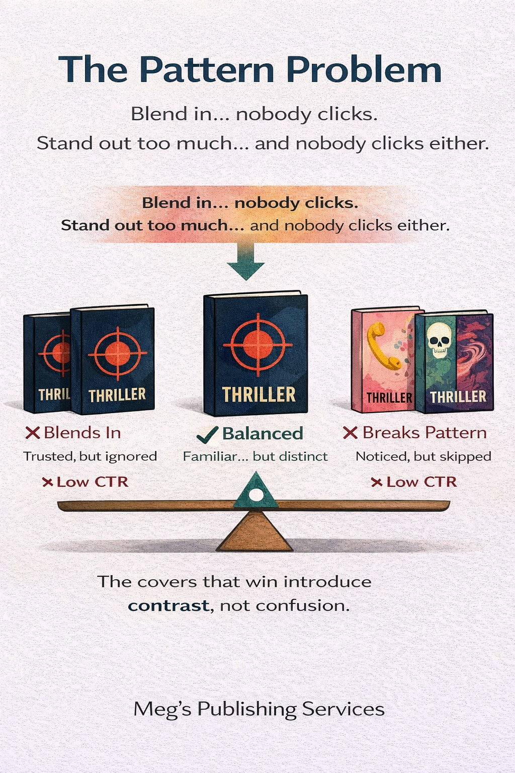
The Pattern Problem
When your cover blends into the crowd, CTR dies. When it deviates too far, CTR dies again. Here’s the balance point.
Most authors think the goal of a book cover is to stand out.
That instinct feels obvious. In a marketplace crowded with thousands of titles, standing out sounds like survival. But on Amazon, standing out is not the same thing as being chosen.
Readers don’t reward difference by default. They reward recognition.
And this is where many covers quietly fail.
Why blending in kills clicks
When a cover looks exactly like every other book in its category, it disappears into the pattern.
Readers scrolling quickly are not stopping to compare quality. Their brain is skimming visual signals, looking for something that feels familiar and distinct enough to notice.
If your cover follows genre norms so closely that it becomes interchangeable, nothing catches the eye. The brain categorizes it as “more of the same” and keeps moving.
CTR drops not because the cover is bad, but because it is invisible.
Amazon learns from that behavior and slowly reduces how often your book is shown.
Why breaking the pattern also kills clicks
Seeing this problem, many authors swing hard in the opposite direction.
They choose unexpected colors. Abstract imagery. Typography that ignores genre conventions. A design that feels bold, artistic, or disruptive.
At full size, these covers often look stunning.
At thumbnail size, they feel risky.
When a cover deviates too far from genre patterns, the reader’s brain struggles to place it. If it doesn’t immediately register as the kind of book they are looking for, hesitation sets in.
Hesitation is fatal on Amazon.
Readers don’t pause to admire bravery. They move toward safety. CTR drops again, for the opposite reason.
What the reader’s brain is actually doing
Readers are not consciously comparing covers. Their brain is running a fast, unconscious sorting process.
First, it asks whether the book fits a known pattern. This answers the question, “Does this belong in the category I’m browsing?”
Then it looks for a small point of contrast. This answers the question, “Is there something here worth noticing?”
If the cover fails the first check, it feels out of place.
If it fails the second, it fades into the background.
The sweet spot lives between those two failures.
The balance point most authors miss
Strong Amazon covers do not try to reinvent the genre. They try to signal membership, then introduce contrast.
They use familiar color families, layout structures, and typography styles so the reader feels oriented. Then they introduce one or two distinctive elements that catch attention without breaking trust.
That contrast might come from:
• a bolder title treatment
• a clearer promise
• a stronger focal image
• cleaner hierarchy
• a sharper emotional signal
What matters is restraint.
Too little contrast and the cover disappears.
Too much contrast and the cover feels unsafe.
Why Amazon rewards balance, not extremes
Amazon tracks behavior, not design intent.
Covers that sit comfortably inside a genre while still attracting clicks generate consistent engagement. Amazon learns that these books are relevant and safe to show to more readers.
Covers at either extreme generate weaker signals. Either they are ignored because they blend in, or skipped because they feel unfamiliar.
Over time, those patterns determine visibility far more than authors realize.
How to think about the pattern problem differently
Instead of asking whether your cover stands out, ask whether it stands out to the right reader.
Does it look like a book they already trust, while giving them a reason to pause?
Does it reduce risk first, then spark interest?
Does it feel confidently familiar rather than loudly different?
The goal is not to be original in isolation. The goal is to be recognizable with intent.
Final thought
On Amazon, extremes lose.
Covers that disappear into the crowd lose attention.
Covers that break too far from the pattern lose trust.
The covers that win understand the pattern, respect it, and then bend it just enough to be noticed.
That balance point is where CTR survives. It’s where visibility grows.