
Typography = Credibility
Why amateur fonts scream “skip this book,” and how font hierarchy silently raises your perceived authority
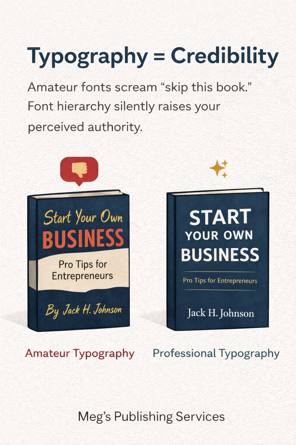
Most authors underestimate typography because it feels cosmetic.
Fonts seem like decoration. A finishing touch. Something you choose after the real work is done. But on Amazon, typography is not decoration. It is judgment.
Before a reader reads your description, before they evaluate your promise, before they even register your topic, they subconsciously decide whether you look credible. And typography is one of the strongest signals shaping that decision.
Readers may not know why a book feels amateur or professional, but they feel it instantly. Typography is often the reason.
Why typography triggers trust before content ever gets a chance
Typography works at a psychological level most people never consciously notice.
Fonts carry history. Weight. Context. Association. Over time, readers learn which fonts feel authoritative, which feel playful, which feel cheap, and which feel serious. Their brain makes these connections automatically, without asking for permission.
When a reader sees an awkward font choice, poor spacing, or inconsistent text hierarchy, their brain flags risk. Not because the content is bad, but because the presentation suggests inexperience.
That split-second reaction matters because Amazon is a trust marketplace. Readers are constantly filtering options to reduce the chance of wasting time or money. Anything that looks unpolished creates hesitation. Hesitation kills clicks.
What amateur typography actually signals to readers
Most authors think amateur fonts are a matter of taste. Readers experience them as a warning.
Amateur typography often signals one or more of the following, even if none of them are true:
• the book may be poorly edited
• the author may be inexperienced
• the content may be shallow or unstructured
• the book may not meet genre expectations
Once that doubt enters the reader’s mind, it is very hard to undo.
They do not stop to investigate whether the signal is fair. They simply scroll to the next option that feels safer.
Amazon records that behavior. Over time, your book is shown less often, not because it lacks value, but because its presentation failed the credibility test.
Why font hierarchy matters more than font choice alone
Typography is not just about which font you pick. It is about how information is organized visually.
Font hierarchy refers to how titles, subtitles, author names, and supporting text relate to each other in size, weight, spacing, and emphasis. When hierarchy is clear, the reader’s eye knows exactly where to go.
Strong hierarchy creates calm. Calm creates confidence.
Weak hierarchy creates confusion. Confusion creates friction.
A cover with five competing text elements, all fighting for attention, overwhelms the reader. A cover with a clear visual order feels intentional, even if the design is simple.
Hierarchy tells the reader that the author knows what matters most. That confidence transfers.
Why “creative” typography often backfires on Amazon
Many authors choose fonts because they feel expressive or unique.
Unfortunately, expressive typography often prioritizes personality over legibility, especially at thumbnail size. Decorative fonts, script fonts, or overly stylized lettering can look interesting at full scale and completely fall apart on a phone screen.
On Amazon, your cover typography is rarely read up close. It is seen small, fast, and in context with dozens of competitors.
If the title is hard to read or visually confusing at a glance, the reader does not try harder. They move on.
Creativity is not the enemy. Misplaced creativity is.
What professional typography does differently
Professional typography does not draw attention to itself. It supports the message.
Strong covers typically use:
• fonts that match genre expectations
• clear contrast between title and subtitle
• limited font families, usually one or two
• spacing that allows the text to breathe
• emphasis placed only where it matters
These choices signal intention and control.
The reader may never consciously notice the font. What they notice instead is how easy the book feels to understand.
Ease builds trust. Trust builds clicks.
Why typography affects perceived authority
Authority is not just about credentials or content depth. It is about how confidently information is presented.
Books with clean, confident typography feel established. They feel like they belong. They feel safe to invest time in.
Books with inconsistent fonts, poor alignment, or cluttered text feel tentative, even if the ideas inside are strong.
Amazon does not promote authority directly. It promotes engagement. Typography influences engagement by shaping first impressions.
First impressions compound.
How to think about typography strategically
The goal of typography is not to impress designers or other writers. It is to reduce friction for readers.
Ask simple questions:
Does this look like the kind of book people already buy in this category?
Is the title readable at thumbnail size?
Is the visual hierarchy obvious without effort?
Does anything feel noisy or uncertain?
If the answer is no, credibility rises automatically.
Typography does not need to be loud to be effective. It needs to be clear.
Final thought
Typography is one of the quietest credibility signals on Amazon, and one of the most powerful.
Readers may never compliment your font choice. They may never notice it consciously. But they will feel the difference between a book that looks confident and one that looks unsure.
On Amazon, confidence converts.
When your typography communicates clarity, control, and professionalism, readers trust you faster. Amazon notices that trust. And visibility follows.
Fonts do not just decorate your book.
They speak for it before you ever get the chance.