
Covers Are Not Art. They’re Conversion Tools
When Claire finally approved her book cover, she felt something close to relief.
It was tasteful.
Understated.
Elegant in a way that felt deliberate and grown-up.
The kind of cover that made sense once you understood the book.
Friends called it “literary.”
Designers praised the typography.
Other writers admired the restraint.
It looked like the kind of cover that signaled seriousness. Intelligence. Good taste.
Claire believed she had made the right choice.
Then the book went live.
The disappointment no one prepares you for
The book didn’t fail loudly. There was no sharp drop, no obvious rejection.
Instead, it drifted.
Impressions trickled in. Clicks were rare.
Sales happened occasionally—usually after Claire shared the link herself.
Nothing appeared broken, yet nothing moved.
Claire refreshed her dashboard more than she wanted to admit, replaying the same thought over and over again:
It’s beautiful. Why isn’t anyone responding?
What Claire misunderstood about Amazon readers
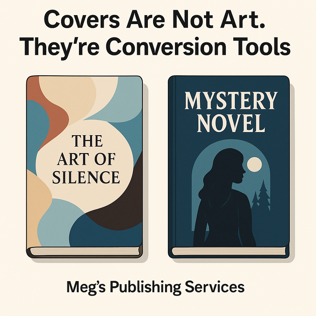
Claire had designed her cover the way someone designs a gallery piece.
With intention and symbolism. With the expectation that the viewer would pause, look closer, and appreciate the details.
Little did she know that Amazon readers don’t shop like gallery visitors.
They shop the way people shop online when they’re busy, distracted, and overwhelmed with options.
They don’t linger.
They don’t decode.
They don’t admire subtlety.
They scan.
Their brain asks one fast, unforgiving question as they scroll:
Is this the kind of book I’m looking for right now?
If the answer isn’t immediately obvious, they move on.
Claire’s cover didn’t fail because it lacked quality. It failed because it asked for patience.
Patience is not how Amazon works.
The uncomfortable discovery
One afternoon, out of equal parts curiosity and frustration, Claire searched for the books her ideal readers already loved.
She lined them up side by side. That’s when the pattern became impossible to ignore.
Those covers weren’t trying to express originality. They were trying to signal familiarity.
The genre was unmistakable at thumbnail size. The typography followed recognizable patterns. Color palettes repeated across different authors.
They weren’t boring but they weren’t mysterious either.
They didn’t ask readers to interpret. They asked readers to recognize.
Claire’s cover, by contrast, looked like it belonged somewhere else. Different in a way that required explanation. Different in a marketplace that rewards instant understanding.
What changed when she redesigned for conversion
Claire didn’t abandon her taste.
She simply reordered her priorities.
The new cover wasn’t louder.
It wasn’t trend-chasing.
It wasn’t trying to stand out at all costs.
It was clearer.
At thumbnail size, the genre was immediately obvious. The tone matched what readers already trusted. The design blended in just enough to feel familiar—and safe.
And almost immediately, the numbers began to change.
Click-through rate improved. More readers opened the preview. Sales followed, steadily and without drama.
Nothing about the book itself had changed.
Only the first impression had.
What this story teaches
A cover is not a personal expression.
It’s a recognition tool.
Readers don’t click what feels meaningful.
They click what feels familiar.
Beauty without clarity creates friction.
On Amazon, friction kills momentum before it ever starts.
Strategic covers don’t reject creativity.
They delay it.
Clarity comes first.
Creativity works inside that clarity—where it can actually be seen.
Final thought
A book cover does not exist to impress other writers or designers. It exists to help the right reader instantly think, This is for me.
Amazon doesn’t reward how thoughtful a cover feels. It rewards how quickly it converts.
When clarity leads, creativity finally gets the chance to matter.
That’s when beautiful books stop being overlooked—and start being chosen.